The City of Brownwood issued the following press release following Tuesday’s city council meeting:
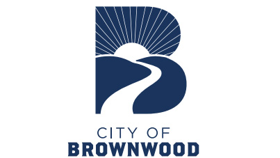
The City of Brownwood adopted a new municipal logo during their regularly called City Council meeting on Tuesday.
Previously, city staff presented conceptual logo options to the council during a workshop on May 12th, and one design was unanimously selected by the council members. “The new logo is a bridge from old to new,” explained Mayor Stephen Haynes. “It pays homage to the ‘Brownwood Feels Like Home’ logo by integrating the rising sun and font style and gives a new look to the traditional ‘City B.’ The rising sun is the most notable element that represents a bright future for our city.”
The new logo will be used for the City of Brownwood as an organization, providing an identity that is separate but also complimentary of the Feels Like Home logo and current community and tourism marketing.
The new logo features rolling hills as a nod to Brownwood’s geographic location at the top of the Texas Hill County. The Pecan Bayou celebrates the natural beauty and recreation along the waterway in Fabis Park, Riverside Park, and the Lednicky Rest Stop. “The Bayou image could also appear as a roadway leading into Brownwood,” Mayor Haynes said, “which signifies our central location and that all roads lead to Brownwood.” The timeless blue hue was chosen, because blue symbolizes calm, confidence, and connection, and represents the city’s stability for residents.
The new logo will be utilized on vehicles, stationery, digital content, apparel, social media, and communication materials. Brownwood residents can expect to see city materials, signage, social media and other communication channels transition over the coming weeks and months.
Detailed City of Brownwood style guide and logo are available on www.brownwoodtexas.gov/styleguide